 In this video we discuss what a time series graph is, and how to construct a time series graph. We cover how to label a time series graph and how to mark a time series graph.
 Transcript/notes
Time series graphs
In this video we are going to go over what is a time series graph and how to construct a time series graph.
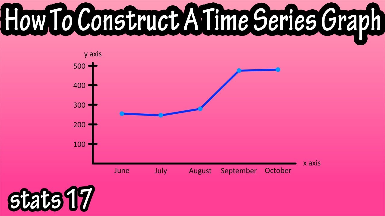
A time series graph is a graph that shows data points over a period of time. For instance you could construct a time series graph for the data in this table, the number of video views for a youtube channel over a 5 month period.
To do this you start by drawing an x and y axis, label the x axis as months, and write in the different months from the data table at equal distances from one another on the x axis.
Then label the y axis as video views in the thousands. Next, from the table, find the highest value in the table, 480,068, round up to 500,000 and we will mark that as 500 somewhere near the top of the y axis. Then make 4 more marks of equal distances going down the y axis marking them 400, 300, and on down to 100.
Next we are going to plot the points on the graph. So, from the first row in the table we have June as our x axis value and 254,260 views as the y axis value. Find that point of intersection on the graph and put a dot there.
Then July and 248,551 views, find that point of intersection and plot a point, and continue this process for the remaining data.
The last thing is to draw in a line from point to point to point. And our graph is complete.
When looking at a time series graph, one thing to take note of is the slope or steepness of the lines connecting the dots, as this will tell you where there are periods of growth, periods of major growth, a very steep line, and periods of decline.
You can also compare 2 data sets on the same graph. As you see here with a line for video views for 2019, and a line for video views for the same time period for 2018.


0 Yorumlar